View of cloudspring on a laptop

Stacks

Product design for a news aggregator app for iOS and WatchOS.

View Prototype

Project Summary

Summary

The Challenge

There’s an overload of information when people try to keep up-to-date with the news. Sometimes it can be challenging to follow a particular topic from breaking news until the story completely develops. In the middle of an important news cycle, another news story can break out, thus distracting and overwhelming the user day after day.

The Solution

This app solves this problem presented above by letting users create a collection of topics using any word or phrase. These would be easily accessible on a dedicated feed and the user will be able to read all the stories based on the topic of interest, following any particular story life cycle from beginning to end, or just to have a bigger perspective of what was published about any event.

The Process

Project Discovery

Discovery

  • Project brief
  • Technical specifications
Strategy

Analysis

  • Research
  • Competitive analysis
  • Personas
Information Architecture

Info. Architecture

Information Architecture

  • Card sorting
  • User stories
  • User flows
  • Wireframes
  • Mockups
  • Usability test
Visual Design

Visual Design

  • Mind maps
  • Mood boards
  • Style guide
  • Hi-fi mockups
  • Preference test
Project Discovery
Product definition

Project Brief

The news app market is an exciting one. People always need to be kept up-to-date. Even with recognizable news outlets in the market for many years, there’s still space for an even more personalized news aggregator app that can combine different features so the user can easily use it. This news app could be set apart by offering:

  • Ability to add news topics to a dedicated news feed.
  • Feature to read a contrasting story for a balanced view.
  • Condense any news story in two short paragraphs.
  • Function to listen to the news using voice control.
  • Offering a watch companion.
  • Ample offering of magazine titles.

Roles

  • Researcher
  • Content Producer
  • Usability Tester
  • Visual Designer

Deliverables

  • Competitive Analysis
  • User Personas
  • User Stories
  • User Flows
  • Wireframes
  • Branding
  • User Testing
  • Prototypes

Tools Used

  • Google Forms
  • Google Docs
  • Optimal Workshop
  • Draw.io
  • Adobe XD
  • Adobe Photoshop
  • Adobe Illustrator
  • InVision
  • Maze
  • UsabilityHub

Project Discovery
Research

Survey

In the beginning, the idea was to produce an app that would filter news based on political preference (conservative, liberal, libertarian, etc). The reason behind it was that it can be frustrating when someone tries to get an objective view of the news but instead encounters a biased article. On the contrary, if the user finds a news source that aligns more with their point of view, the reading experience could be more enjoyable.


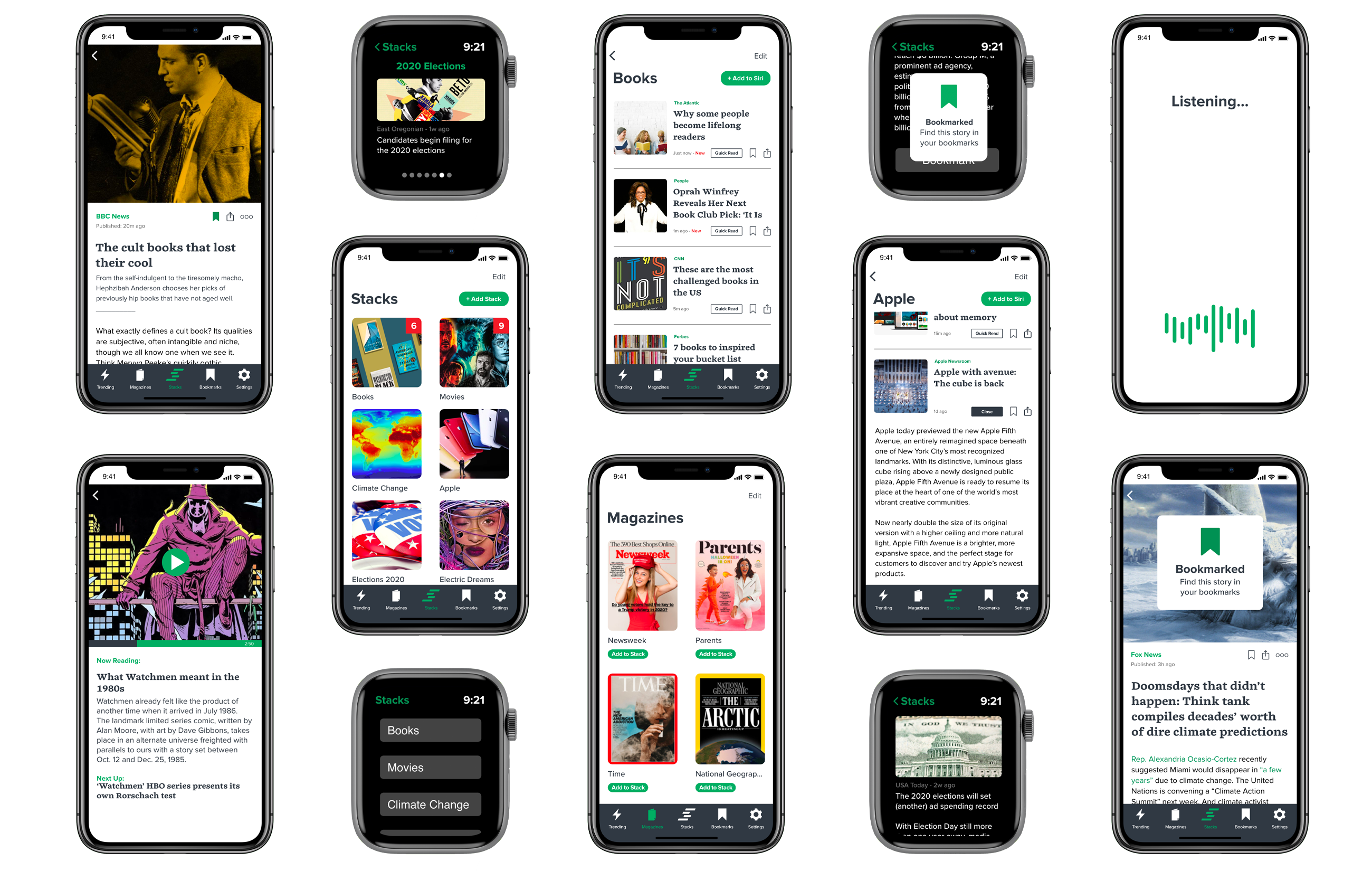
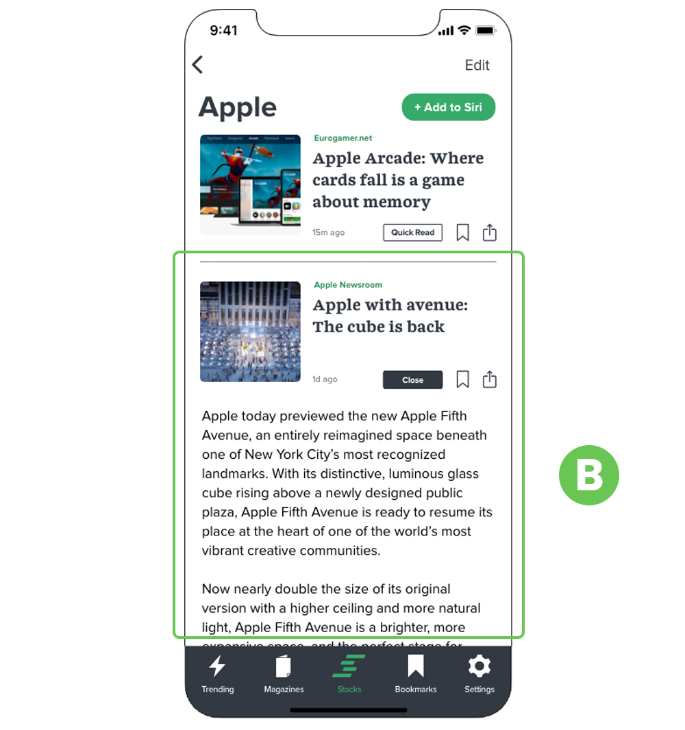
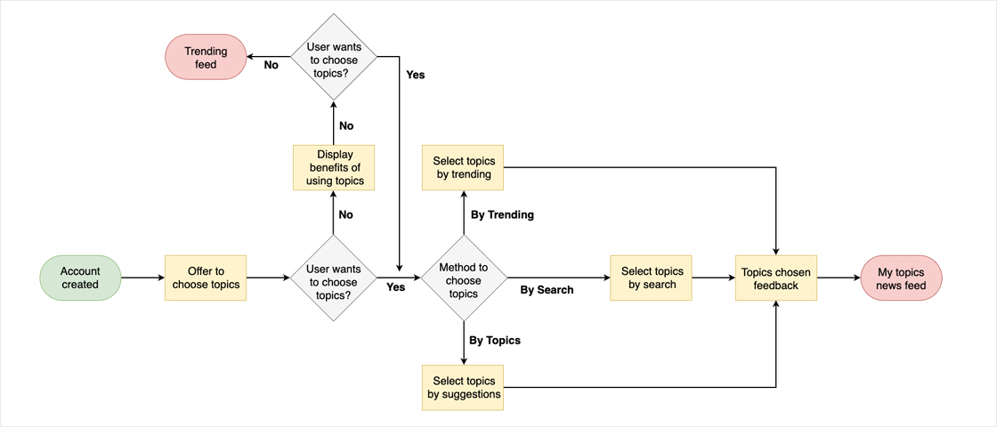
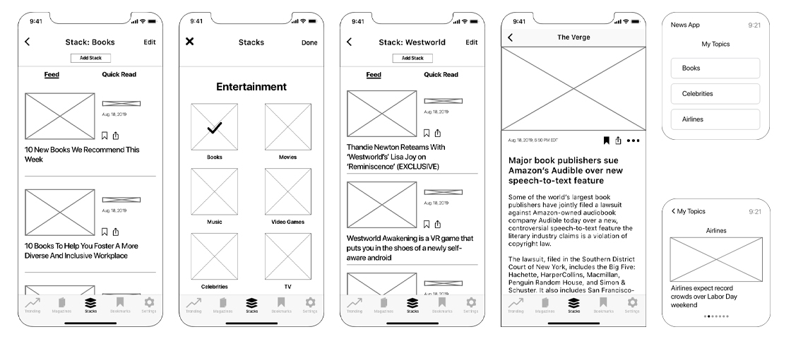
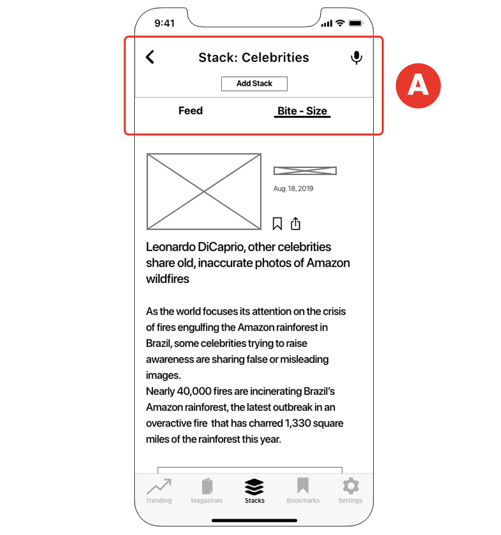
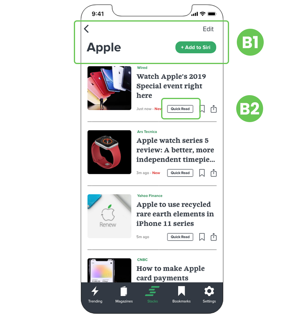
But, after the initial research, I found that there was little to no appetite for an app with these features (84% of participants). I had to rethink the whole concept, and with the help of 1-on-1 interviews, I landed on another concept: an app that displays all the news stories based on a particular topic in one dedicated feed.


I performed another round of research, and these were the results:

75% Would like to be presented information based on chosen topics.

78.1% Read the news on a daily basis.

42.9% Don’t read the news because of a lack of time.

64% Regularly read the complete story.

20% Usually read the first two paragraphs of a story.

44% Would consider a feature that reads the news for them.

Read Survey Analysis

Project Discovery
Research

Competitive Analysis

I downloaded many news apps and started exploring them to understanding what they do best or what could be improved. I was also researching if any of those apps had the features that were planned for the app I was working on. However, since analyzing all of them was unrealistic because of time constraints, I chose the top 3 apps based on the answer people gave on the following question from the survey: “What news app or website you get your news from?”

Appeals to users that want to get real-time news. They serve young and mature clients. However, the app does not have easy-to-find call-to-action buttons and suffers from confusing navigation. As a strength, they enjoy brand recognition and unified branding across all mediums. The app has all the features users might expect, including a bookmark function.

Distributes news to the end-user from other news sources. The strength of the service is: easy access to the context of a story and multiple perspectives. The user can set up email alerts on various topics. There’s also a voice feature where the user can open up news sources by using Siri, although this feature is not easily noticeable.

This app comes built-in in Apple devices, so it is easy to start using it if you have an Apple product. It features animated covers in some magazines to enrich the reading experience. Different users can use it within one plan (Family sharing). It has an editor-curated coverage of current events. However, some functions are not so easily accessible like the bookmark feature.

Read Report

Project Discovery
analysis

User Personas

To construct the profile of the user, I conducted phone and face-to-face interviews with a few people. Before meeting with them, I created a questionnaire so I can be prepared when meeting them. After that I created three fictional use cases based on the interviews:

A picture of user persona Vanessa Polcyn “I would like a news app that can serve only the information of a certain topic that I want to read”.

Vanessa Polcyn

43 years old

Controller

Story

Vanessa is a professional hard worker that works as a comptroller for a restaurant chain. She lives a very organized life, always planning ahead of time. Vanessa commutes every day to work on the train where she reads the news, books, or magazines. She usually checks the news twice a day: In the morning and in the afternoon at the end of the workday. Outside of work, she is very active and likes to go biking and playing golf.

Goals

  • Wants to keep tabs on information that she can relate to.
  • Keeps digging until learning the complete picture of any news.
  • Learns from different viewpoints.
  • Widen my knowledge in other non-news related topics.

Frustrations

  • Unrequested apps asking for my email when reading stories.
  • Can’t choose topics to follow.
  • Don’t like apps pushing for subscriptions.
A picture of user persona Greg Roy “I would like an app that can always keep me in-the-know, and also give me a deep wealth of information”

Greg Roy

62 years old
Retired

Story

Greg is a retired man living by himself in New York City. He worked for a bank all his life and developed a deep love for reading, and now that he is retired, he has time to sit and read long interesting articles to stimulate his mind. He also enjoys visiting his friends and family. He enjoys using the internet and other gadgets, but his use is limited since he uses them to shop and read news most of the time.

Goals

  • Wants to read the news to comprehend the whole picture of an issue.
  • Wants to know the latest news.
  • Reads news from other countries.

Frustrations

  • All the news articles basically come from the same source, too repetitive.
  • Not easy to explore other points of view.
View Personas

Information Architecture
Analysis

User Stories

To create stories, I referred to the goals and frustrations of the personas, and I also took a look at how some competitor’s app lets the user complete certain tasks. All these techniques helped me create stories for a visiting user, new user, and returning user. In the beginning, the stories that I came up with were somewhat vague. After consulting with a senior designer, I made the user stories more specific so that anyone looking at them could easily know what the action or task is.


The following user stories form the basis for the MVP:

Role Tasks Importance
As a new user I want to read my topics as bite-size information High
As a new user I want to be read out loud my bite-size topics headlines High
As a new user I want to read a news article from my topics, trending news or bookmarks High
As a new user I want to bookmark an article that I'm currently reading High
As a new user I want to read related news based on a recently read article High
All users I want to contrast two news articles High
All users I want to open the app on my weareable device High
All users I want to access my bookmarks High
See All Stories

Information Architecture
Analysis

User Flows

I created user flows for both the mobile app and the watch app. Once again, I looked at competitor’s apps to get ideas I could implement or looking out for problems I could address. For me, this was a good step to empathize with the user, since the fewer steps or frictions I add to the task, the more enjoyable their experience would be. I also learned to be specific and not assume that a step was so well-known to someone looking at the flow, that I should omit them.

Cloudspring Dashboard image showing All Files

User flows done on hand

Example of three developed user flows

User flows done digitally

See all Flows

Information Architecture
Design

Skeching and Wireframes

Finalized the user flows, it was time to start putting the research into design form. I first sketched the different screens on paper, then created a quick paper prototype to test at least 3 flows. I wanted to test early and often to eliminate or discover any issue before moving too much forward. From this test, the data that I gathered was that is important to the user to know when an article was published. Right after this initial quick test, I drew the sketches on the computer. After all the screens were done, I performed a second, and complete usability test of all the flows.

Cloudspring Dashboard image showing All Files

Sketches for iOS and WatchOS

Cloudspring Dashboard image showing All Files

Quick iOS paper prototype

Cloudspring Dashboard image showing All Files

Low fidelity wireframes for iOS and WatchOS

All wireframes

Wireframes Testing

Before testing the wireframes, I did notice that my design looked too much like Apple’s design language. This was because I tried to design with Apple’s specifications. But I felt uneasy with the result. So I went back to the drawing board and I tried again to give it a more original look. I also looked at other related apps. When I was satisfied with the design, I brought it to InVision to test with users and also to Maze to test remotely. Some of the findings were:

Creating a new stack

Before:

Wireframe showing the process of uploading an image

Upon account creation, the user would land at a blank state page encouraging them to create a new stack, A but during testing, I found that the screen was unnecessary since the same thing could be better accomplished by encouraging the user to select from predefined categories instead.

After:

Wireframe showing sign up page

I added a short copy B1 letting the user know that they are not following any stack at this moment, but also the screen now presents 3 different ways to create a stack: By searching, by trending topic or by category. B2.

Icons as indicators

Before:

Wireframe showing the process of uploading an image

I noticed that users were lingering on the create a stack page, this made me understand that they were not sure what was clickable. A

After:

Wireframe showing sign up page

To assist them and decrease the cognitive load, I added plus signs icons next to the images in order to alert the user that they could interact with that element. B

Bite-Size (Later Changed to “Quick Read”)

Before:

Wireframe showing the process of uploading an image

While interacting with the bite-sized story feature (Later changed to “Quick Read”) I started noticing some confusion on the news feed screen. I saw too many unnecessary clicks on the top buttons, and I thought that was because the app was offering too many options and the user was getting either distracted or getting information overload. I kept this on my mind for the next iteration and see how I could resolve this issue. A

After:

Wireframe showing sign up page

The solution was to clean up the top portion of the bite-sized story (Later changed to “Quick Read”) screen, but I did not fully know how to organize all the components up until I started doing some preference test on that screen, when a user pointed another feature out, while I was taking care of that one, it all fell into place and I organized this screen better.B

Explore the heatmaps

Branding
Design

Branding

I knew it was important to come up with the right name for this app. Even though I had some names at the beginning of the projects, I preferred to involve the users, get feedback from as many people as possible, so I can come up with a strong brand that could support the app's functionality. These are the components of the brand:

Icon

For the icon, I explored different shapes. I had my personal preference but kept iterating until I finally decided to use a stackable shape that would go along with the name “Stacks”. The icon went into further iterations, and more preference tests, until it was refined.


One of the ideas I was exploring involved the use of negative space to bring out the “S”, but time after time the users during preference testing, could not see it, so I abandoned this idea and ultimately, came up with one where the meaning was more clear and elegant.

Moodboard for brand inspiration

Two variations of the logo with different backgrounds

Mood Board

The mood board helped me unified the brand and get even more creative ideas for the overall look of the app. Based on initial research, mostly from the 1-on-1 interviews, I noticed that the potential user was someone with a taste for clean and straightforward design. Keeping this in mind, I searched for these characteristics for inspiration.

Moodboard for brand inspiration

Various elements found online that served as inspiration for the brand

Colors

For the colors, I tried to use a combination of calm colors to make the user comfortable while reading and interacting with the app and keeping the experience enjoyable.

Moodboard for brand inspiration

Colors forming the brand

Typography

The typography is a combination of serif and sans serif fonts to create contrast. The title of the news topics is set in a serif font, and the articles are sans serif to help the user feel more comfortable when reading.

Style Guide for the Brand

Typography for the brand

Illustrations and Icons

I created the icons and illustrations to support the branding and to pair it with the design. I wanted them to serve as visual aids when the reader might prefer to visually interact with the app, and in the case of the illustrations, to bring familiarity and make the experience interesting.

Style Guide for the Typography

Various icons and graphics used throughout the interface

See Style Guide

Branding
Design

Preference Test

I performed various preference tests to evaluate which design was better for a particular screen.


The feedback I got from the preference test was invaluable since besides deciding on the options, I could discover other issues: Users not understanding certain components of the design unrelated to the preference that they were performing. That allowed me to empathize with them once again and make the necessary changes.


For example, one of the struggles I had as the interface designer was how to clean the top portion of the news feed screen, and thanks to the input of some users, I devised a better way to display those buttons.

News Topics Screen

Branding

60% Preferred 2 squares per row.

Branding

40% Preferred 1 horizontal rectangle.

News Feed Screen

Branding

93% Preferred news title with horizontal line as separator.

Branding

7% Preferred news presented as "cards".

Article Screen

Branding

60% Preferred to always see the status bar.

Branding

40% Preferred the main image to hide the status bar.


Information Architecture
Design

Prototype

To implement the findings of the usability test, and to apply the branding, I created a high fidelity prototype of the app that I could further test with users.


One of the challenges I had to overcome during the low-fi prototype was the way I designed the prototype was a bit confusing to the user because there were so many screens if the user made an unexpected decision, the next screen could be something that they were not expecting. I overcame this issue by re-assembling the prototype and made the flow simpler and linear.

Cloudspring Dashboard image showing All Files
All High-Fi Wireframes

Prototype Testing

I created high-fidelity mockups for the website that would serve to announce the app, the app itself, and the watch companion. One of the challenges I had was how far I can rethink the interface when applying color, typography, and trying new layouts, that won’t deviate too much from the low-fidelity wireframe that I tested before. I did apply the changes based on the previous testing, but, overall, tried to keep the same design feel and layout design. I tested the mockup with three users: 2 via video conference and 1 on a 1:1 interview. Some of the changes after testing were:

Homepage

Before

Wireframe showing the process of uploading an image

On the three occasions that the app was tested, I noticed that it was a bit difficult for the users to deduct what this app was about by just looking or scanning the homepage. This presented a big problem since this would be one of the mediums for the public to get to know the app and understand what it does. A I had 2 “Download Now” action buttons nearby: One above the fold and the other below the fold. During testing, the users were getting confused as to which button would let them download the app or take them to the app store.A.

After

Wireframe showing sign up page

I refined the copy on the homepage, gave it more space to breathe to make it more scannable, and also added a paragraph explaining what this app was about right below the fold. B. I separated both buttons: Kept one above the fold and moved the other one before the footer so it can function as the last action that the user would take after scanning the page. B

Listening to the stacks

Before

Wireframe showing the process of uploading an image

This feature, even though it demonstrated that it was interesting to the people testing the app when was discovered while browsing the homepage, could not be well tested because of software issues. The testers tried to speak and give a command, but on three occasions it was tested, the software could not understand. They were trying to say “Emmys” and I suspect the problem came up because it was a word a bit tricky to pronounce and for the software to understand. A.

After

Wireframe showing sign up page

I changed the news stack to “Watchmen” and will run a test of just this particular iteration to see the results. B.

"Quick Read" Feature

Before

Wireframe showing the process of uploading an image

This feature was intended to function as a way for the user to quickly get the main points of any news (condensed in 2 brief paragraphs). The way it was presented to the user testing was that upon clicking one button, it would expand all the news in the feed at the same time and let the user browse. During testing, users pointed out that they would prefer it to open each story individually. A.

After

Wireframe showing sign up page

I changed the behavior of the quick read feature. Instead of opening the whole feed to reveal 2 paragraphs per story, behavior that caused information overload and the user to browse a long page, now each story has a button where the user can choose to click and reveal each news as they like. They can also close it from here. A by-product of this solution was that it permitted the area of the top screen to look spacier since the 2-tabs system that existed before (“FEED” and “QUICK READ”) was no longer necessary.B.

Article Screen

Before

Wireframe showing the process of uploading an image

When the users were reading a particular article, on more than 1 occasion I got comments like “I like the feature where I can see how long a story would take to read”, however, at that moment that feature was not present: People were mistakenly thinking that the publishing date was the time it would take to read the story. A

After

Wireframe showing sign up page

I added “Published” right before the date to clarify that it was the published date. B

Watch the videos

Product Highlights
Product
Highlights

Product Highlights

This app feature:


  • Follow any particular news topic in one or many dedicated news feed.
  • Bookmark any article.
  • Personalized recommendations.
  • Read different points of view.
  • Voice control feature.
  • Read two paragraphs of any news.
  • Easy channel personalization.
  • Accessible via mobile app and watch app.

Stacks creations

The user can create any "stack" and follow it on a dedicated news feed.

Contrasting points of view

For certain news articles, if the AI finds a contrasting article, it will offer it to the reader for further reading.

Voice control

The user can program the app and listen to articles while engaging in chores.

Bookmarking

Articles that the user finds interesting or articles that would like to read later, can be bookmarked.

Watch companion

The watch app serves as a companion to enhance the experience.

Quick Read

The AI can condense long articles into two paragraphs serving the user just the information they need.

View Prototype

What I learned

This project was exciting and challenging at the same time. When I started it, I thought that I would be able to do it quickly, but I soon realized I needed to invest a considerable amount in time testing, solving challenges, and getting feedback as much as possible. It also cemented some UX concepts in my mind and made me be better prepared for the next UX projects ahead.


It was exciting to work on the voice feature. This is one branch of UX that I would like to explore more in the future. If given more time, I would have like to perform more testing on the watch version.